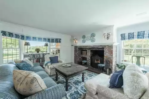
I read somewhere that certain dining room paint colors, like red and burgundy, can make you hungry and others can make you lose your appetite. Regardless of whether or not that is true, I could not being myself to paint our room red. With this being said, I did want to share our recent dining room decor makeover. Most of the changes we made were through paint. The foundation of our room was already pretty nice. We have a classic white chair rail and panelling, a lovely tray ceiling, and lots of natural light via the two walls of floor to ceiling windows. All the space needed was a little color and decorative accents. I used this site to find dining room color ideas that would not corner me into one particular decor style. I would not consider our home to be decorated in a traditional look, nor a particularly modern design either. I chose this shade that is a mix between green and deep grey because I felt it would make the white panelling standout more. This ended up being a fantastic choice because the contrasts in shades created a classically elegant look that we love.

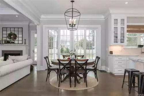
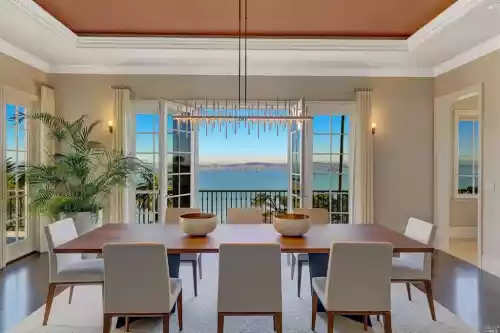
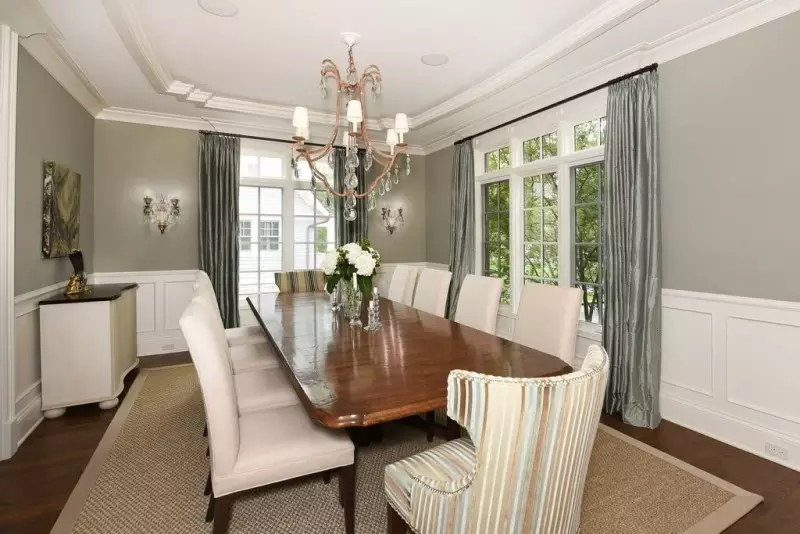
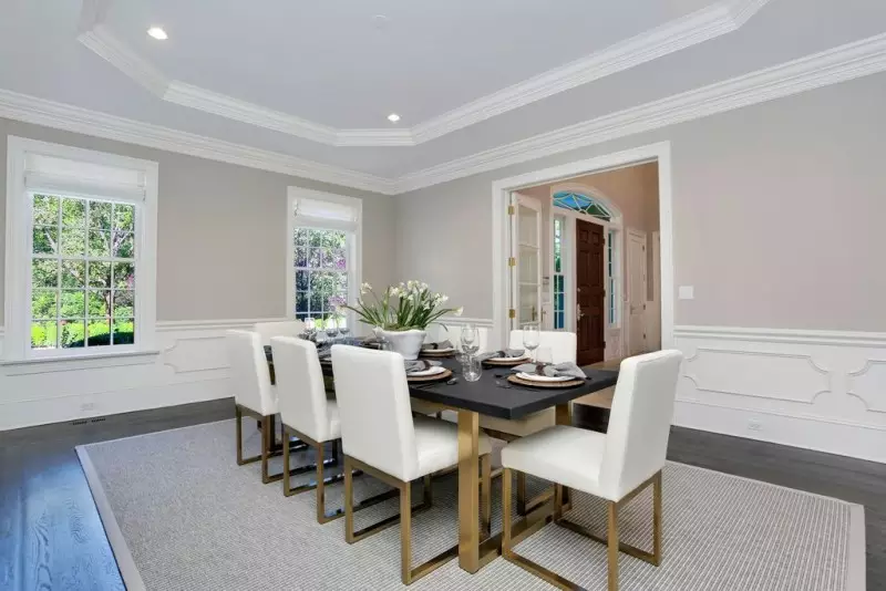
What I like most about this stunning dining room table decor is its minimalist appeal. It includes just a classic centerpiece table that looks inviting and hosts eight people without appearing intimidating. The simple chairs with lightly colored upholstery and the soft beige carpet beautifully complement each other and the darkness of the table top. The chandelier hangs low and its soft lights lend a calming appeal. Furthermore, this decor provides one of the best dining room wall ideas with juxtapose the dark grey toned upper wall and white moldings in the lower half, creating a stunning contrast. Of all the dining room paint colors, grey is perceived as the dullest shade; however, in this glamorous setting, it adds a touch of elegance. The white blooms at the center of the table add a fresh touch as does the burst of green in the corner of the room. The arched French door bordered with the white paneled molding overlooks the garden beyond, creating an impressive backdrop for an elegant dinner.

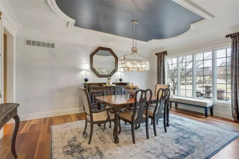
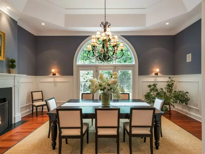
A lot of our clients are looking for unique dining room paint ideas that play around with color in unexpected ways. I am so happy that decor trends for 2022 are moving away from drab beiges and other neutrals, and instead celebrate the use of bold colors throughout interior decor. More formal areas like a dining or living room are a great place to use this trend, because they are not used as frequently as other areas of the house. This makes it the perfect place to go wild with bold or unexpected wall paint colors, finishes and textures. This dining room is a great example of how you can create a very elegant space, while playing around with deep bold colors that you might be afraid to use in other areas of the home. We painted the walls is a gorgeous soft eggshell blue, then painted the tray ceiling in a stunning deep indigo shade. The ceiling color perfectly mirrors the darker shades of the plush area rug down below. The dining room paint colors are actually the boldest design element in this space, and merely accentuated by the other decorative pieces we scattered throughout.

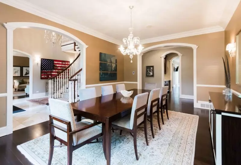
I had been browsing tons of dining room pictures online in order to figure out the right color palette for our space. Little did I know that my inspiration would actually come from the paint catalogues at my local home improvement store. Sherwin Williams has a historical homes collection that features the best dining room colors to utilize in period homes. All of the shades are based on colors that have been documented in homes on the national historic registry. The way they blended the shades in their idea galleries was absolutely stunning and showed me exactly how I could pair the various options to produce the exact look I wanted. After browsing the swatches, I decided on these two dining room paint colors from the colonial collection. I loved the unexpected pairing of dusty blue and muted taupe, especially using them on the walls and ceiling. These two shades worked perfectly with the existing white panelling because it made the ornate detailing really pop. As you can tell from my dining room pictures, our makeover turned out fabulous.

What I like most about this stunning dining room table decor is its minimalist appeal. It includes just a classic centerpiece table that looks inviting and hosts eight people without appearing intimidating. The simple chairs with lightly colored upholstery and the soft beige carpet beautifully complement each other and the darkness of the table top. The chandelier hangs low and its soft lights lend a calming appeal. Furthermore, this decor provides one of the best dining room wall ideas with juxtapose the dark grey toned upper wall and white moldings in the lower half, creating a stunning contrast. Of all the dining room paint colors, grey is perceived as the dullest shade; however, in this glamorous setting, it adds a touch of elegance. The white blooms at the center of the table add a fresh touch as does the burst of green in the corner of the room. The arched French door bordered with the white paneled molding overlooks the garden beyond, creating an impressive backdrop for an elegant dinner.

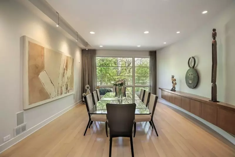
Dining room design is one of those things that seems so cookie cutter to me. Most rooms that I see have a chair rail or panelling, some type of chandelier, and a stuffy formal dining table and sideboard. We hired a designer so that our space would look the opposite of that. I wanted dining room decor ideas that stand out and really wow our guests. Well we got exactly what we asked for. Our interior decorator took all of our requests and transformed our existing room into this awesome contemporary art-lovers haven. The biggest modification she made was changing the dining room paint colors to this lovely steel grey shade, and installing museum-style spot light fixtures. As you can probably tell, we are super into abstract art. Especially huge statement pieces like the one hanging in our new dining room design. They made this piece the focal point of the space by adding tract lighting above where it is mounted. The dining table and curtains were then selected based on the shades and shapes found in the artwork.